Above are some of the ideas I had for the narrative part to the video.
Sunday, 14 January 2018
Narrative
The song I have chosen to use is 2 minutes and 45 seconds long, so I needed to plan out what I was going to do during that time. I thought that I could have a performance during the chorus, and the rest of the song involving a narrative.
Above are some of the ideas I had for the narrative part to the video.
Logo ideas
I decided to create a mockup idea of what my logo could look like. I took inspiration from several different logos which were from the indie genre or were particularly well known. I felt that I needed to create something which was interesting but also recognisable.
I liked the idea of using different letters for words and using shapes, as this related to the indie genre.
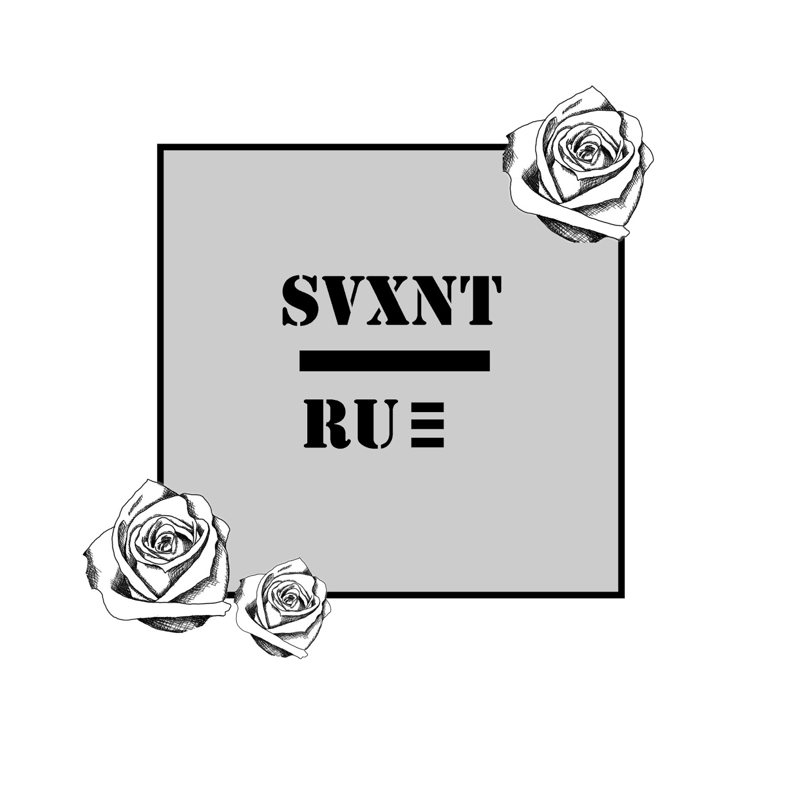
I went on to create a logo in Photoshop which I would use as a second mockup to finally decide on the ideas I had. I went for the colour grey in the background, as I thought that this was an 'indie' colour and would show the grunge feel. Additionally, the roses were something I had taken as inspiration from different logos and also, I felt that the lettering also matched with the genre but also the logos I had researched.
I liked the idea of using different letters for words and using shapes, as this related to the indie genre.
I went on to create a logo in Photoshop which I would use as a second mockup to finally decide on the ideas I had. I went for the colour grey in the background, as I thought that this was an 'indie' colour and would show the grunge feel. Additionally, the roses were something I had taken as inspiration from different logos and also, I felt that the lettering also matched with the genre but also the logos I had researched.
My final idea for my logo was something which I felt related with my overall theme and message within the song. I went for the colour scheme of red and pink with roses, as this related to the rest of my digipak.
List of people involved
People involved
In my music video, I decided that I was going to be in the band singing, as I knew the song well and I was able to lip sync in time. It was easier for me to do the singing part rather than have someone else learn the song. One of my main strengths is photography, so I knew how I needed to be framed, and where I would need to stand to be in a certain composition. I also knew about lighting, and this was helpful in to deciding where and when to film the music video. I was also able to access a photography studio, and this was incredibly helpful as I was able to film the performance part in there. When planning the music video, I felt that I was able to help with the performance side of things, as I know about the indie genre and I have watched several indie music videos, so I knew how they were done. I felt that this was important, and would enable me to create a music video which fit the genre. Even though I featured in the music video, I filmed parts of the performance when I wasn't in the frame and also the narrative. The skills that I have learnt from photography in the past few years were extremely beneficial for the music video, and hopefully these will be shown throughout my work.
Also featured in the performance part of the music video is a friend, whose name is Rebecca. She knew roughly how to play a guitar, so I felt that this would be useful in the video. It was important that in the music video someone who wasn't shy in front of the camera was included. One of Rebecca's strengths is that she is confident, and isn't camera shy. This was incredibly useful, as she was also a drama student, so allowed her performance to be almost professional looking rather than spontaneous. She was willing to help after school too, so I had plenty of time to film as many parts as I could.
Additionally, in the narrative part of the music video, I decided to include an ex-media student, Cloe. As she has done media before, it made the filming slightly easier as she knew what I had to do. Cloe has been included in two other of my media productions, so I knew that she would get the filming done for me properly. I had told her what my plan was to do for the narrative, makeup, costume etc. so she was also able to get herself ready for the filming day. She is always up for a challenge, so helping me with filming was no problem for Cloe. She is quite camera shy usually, but when she can act in a different way and perform, she expresses herself and always puts on a good character.
Digipak idea
Digipak front cover idea
For the album's front cover, I wanted to take some inspiration from the Mona Lisa, as the title of the song I have used (Moaning Lisa Smile) features elements of the painting. To do this, I wanted to make sure that I positioned myself and my fellow band member Rebecca in a Mona Lisa styled way. I decided to merge the two images together, creating a combined Mona Lisa idea. I also changed some of the colours within the images so that the difference in band members photographs could be seen.
I then went on to use the background of the Mona Lisa in the background of my image, so that the intertextuality of the painting was present.
I wanted to include the theme of a wedding within my digipak, so decided to use images of my character and a rose.
For the album's front cover, I wanted to take some inspiration from the Mona Lisa, as the title of the song I have used (Moaning Lisa Smile) features elements of the painting. To do this, I wanted to make sure that I positioned myself and my fellow band member Rebecca in a Mona Lisa styled way. I decided to merge the two images together, creating a combined Mona Lisa idea. I also changed some of the colours within the images so that the difference in band members photographs could be seen.
I then went on to use the background of the Mona Lisa in the background of my image, so that the intertextuality of the painting was present.
I wanted to include the theme of a wedding within my digipak, so decided to use images of my character and a rose.
Costume
Costume
Costumes were an important part of the music video, so therefore I had to ensure that it fit in with the genre and narrative. In the performance part of the video, I wanted to stick with the normal/indie characteristics, as I wanted my music video to relate to the genre. The colours of the clothing which featured in the music video were not necessarily a problem as I was going to make the video black and white. I didn't want vibrant colours as I felt that this wouldn't match with the genre I had chosen.

For the narrative part of the video, I decided to use a wedding dress, a veil, a plain white t-shirt and jeans to represent a 'runaway bride'. As my focus group had said that a wedding dress would be good for the music video, I thought that I would listen to this feedback and respond to their ideas. This would progress the overall narrative, and would allow me to show the audience that I had decided to respond to feedback of a wedding theme.
Friday, 12 January 2018
Album poster research
I have decided to research posters as I will be creating one for my band. I felt that I needed to gather different information about layout and what to include so that I could create an interesting one for my band. I have researched indie bands' posters, as this is what my chosen genre is.

The Arctic Monkey's album poster is very simple, but incredibly effective as people know instantly what the band is trying to get across. The use of the logo and band name allows the audience to recognise the band, as these are distinct to the band. The use of black and white within the poster relates to the album which they released with this poster, and is a bit of a teaser for the release. Additionally, the use of the simple text at the bottom of the poster catches the eye of the viewer. Even though there isn't much text, the idea has been put across and has allowed the band to advertise their album prior to the release.

Foals' album poster is also based in black and white (something which is a characteristic of indie) and is effective. The use of the sketched image of the band is an indicator of what the album cover and inside contents of the album cover may look like. Also, the artists have also included the tour dates within the poster; this encourages the audience to also go to a tour date as well as buying the album. I think that the simplistic designs are effedtive, as they get straight to the point of promoting and advertising the album.
Wolf Alice's poster features the album cover and logo with tour dates. The poster also includes the small section at the bottom which promotes the new album release. The overall design of the poster is to promote both the tour and encourages the audience to buy the new album. The overall layout of the poster is quite full, featuring lots of different information about the band. The poster also has links to the bands website and social media pages; I will use this within my own band poster, as this draws recognition to the band.
Arctic Monkey's album poster

The Arctic Monkey's album poster is very simple, but incredibly effective as people know instantly what the band is trying to get across. The use of the logo and band name allows the audience to recognise the band, as these are distinct to the band. The use of black and white within the poster relates to the album which they released with this poster, and is a bit of a teaser for the release. Additionally, the use of the simple text at the bottom of the poster catches the eye of the viewer. Even though there isn't much text, the idea has been put across and has allowed the band to advertise their album prior to the release.
Foals' album poster

Foals' album poster is also based in black and white (something which is a characteristic of indie) and is effective. The use of the sketched image of the band is an indicator of what the album cover and inside contents of the album cover may look like. Also, the artists have also included the tour dates within the poster; this encourages the audience to also go to a tour date as well as buying the album. I think that the simplistic designs are effedtive, as they get straight to the point of promoting and advertising the album.
Wolf Alice's tour poster with album promo
Wolf Alice's poster features the album cover and logo with tour dates. The poster also includes the small section at the bottom which promotes the new album release. The overall design of the poster is to promote both the tour and encourages the audience to buy the new album. The overall layout of the poster is quite full, featuring lots of different information about the band. The poster also has links to the bands website and social media pages; I will use this within my own band poster, as this draws recognition to the band.
Wednesday, 10 January 2018
Filming Day #2
I decided to film certain parts of my music video again, as I wasn't happy with some of the footage I had. I felt that the camera shots were too basic, and some of the videos were out of focus. As my partner left through the making of the video, I had to take action and film certain parts again, as now it was my music video and I didn't have to incorporate any ideas from anyone else.
I went filming again with my main character on a Sunday this time, as the weather was nice, but cold, and wouldn't affect the continuity of the overall video. I managed to get a whole new range of shots and footage which would allow my music video to express the skills that I have learnt throughout the course. I decided to film in the same place as before so that it didn't affect the continuity.
Subscribe to:
Posts (Atom)