
I liked the idea of using different letters for words and using shapes, as this related to the indie genre.
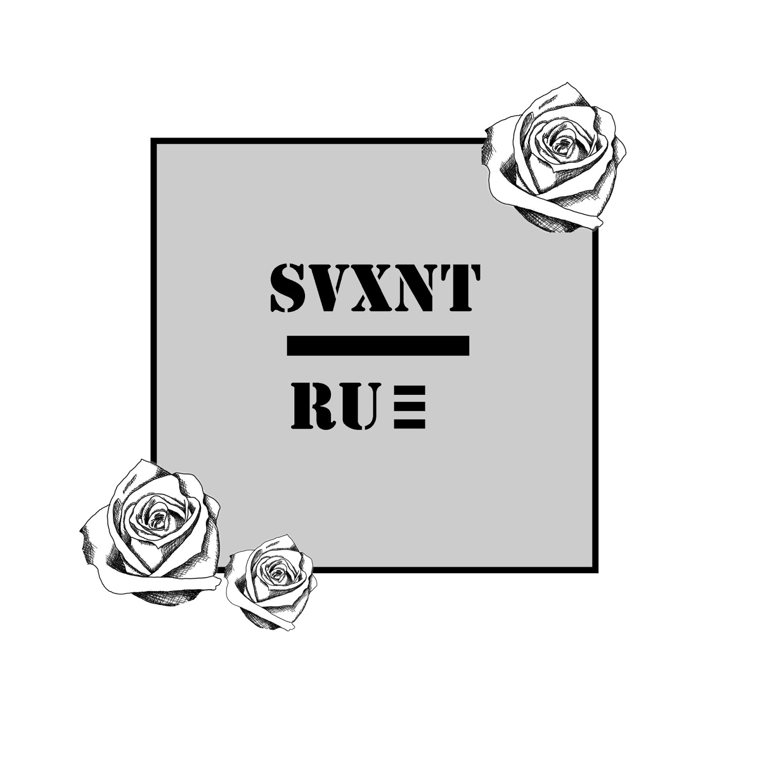
I went on to create a logo in Photoshop which I would use as a second mockup to finally decide on the ideas I had. I went for the colour grey in the background, as I thought that this was an 'indie' colour and would show the grunge feel. Additionally, the roses were something I had taken as inspiration from different logos and also, I felt that the lettering also matched with the genre but also the logos I had researched.
My final idea for my logo was something which I felt related with my overall theme and message within the song. I went for the colour scheme of red and pink with roses, as this related to the rest of my digipak.

No comments:
Post a Comment