I decided to firstly look at the Arctic Monkeys' logo for their album 'AM', as this was something which I thought was simple but effective. I especially liked how the use of a shape was used, combined with font and a frequency wavelength inside of the circle. I felt that shapes were something that was an indie element and that I could do something which involved a certain shape. I thought that in the middle of the logo, the frequency wave had been manipulated into an 'AM' which relates to the title of the album. I thought that this was clever and effective, as this distinguishes the band.
I then looked at Bastilles' logo, which features their band name, but the use of a triangle which replaces the A. I thought that this was interesting and something which was memorable. It distinguishes the band, as when people see the logo, they automatically know who it is. I thought that the use of shapes within a logo was a reoccurring thing and that this was something which I could use my own.
This simplistic logo is for a band called The Neighbourhood. Even though the use of the upside down house is simple, it is incredibly effective as the band is recognised through the use of this logo. I feel that the use of shapes are prominent throughout the indie genre logos, and this was something which I felt that I could include in my own.

Another logo which caught my eye was the band Churches'. I liked the way that they had replaced certain letters with different letters; I think that this makes the logo unique. I also liked the way that they had used three lines to make an E. I thought that I could take inspiration from this to create my own logo.
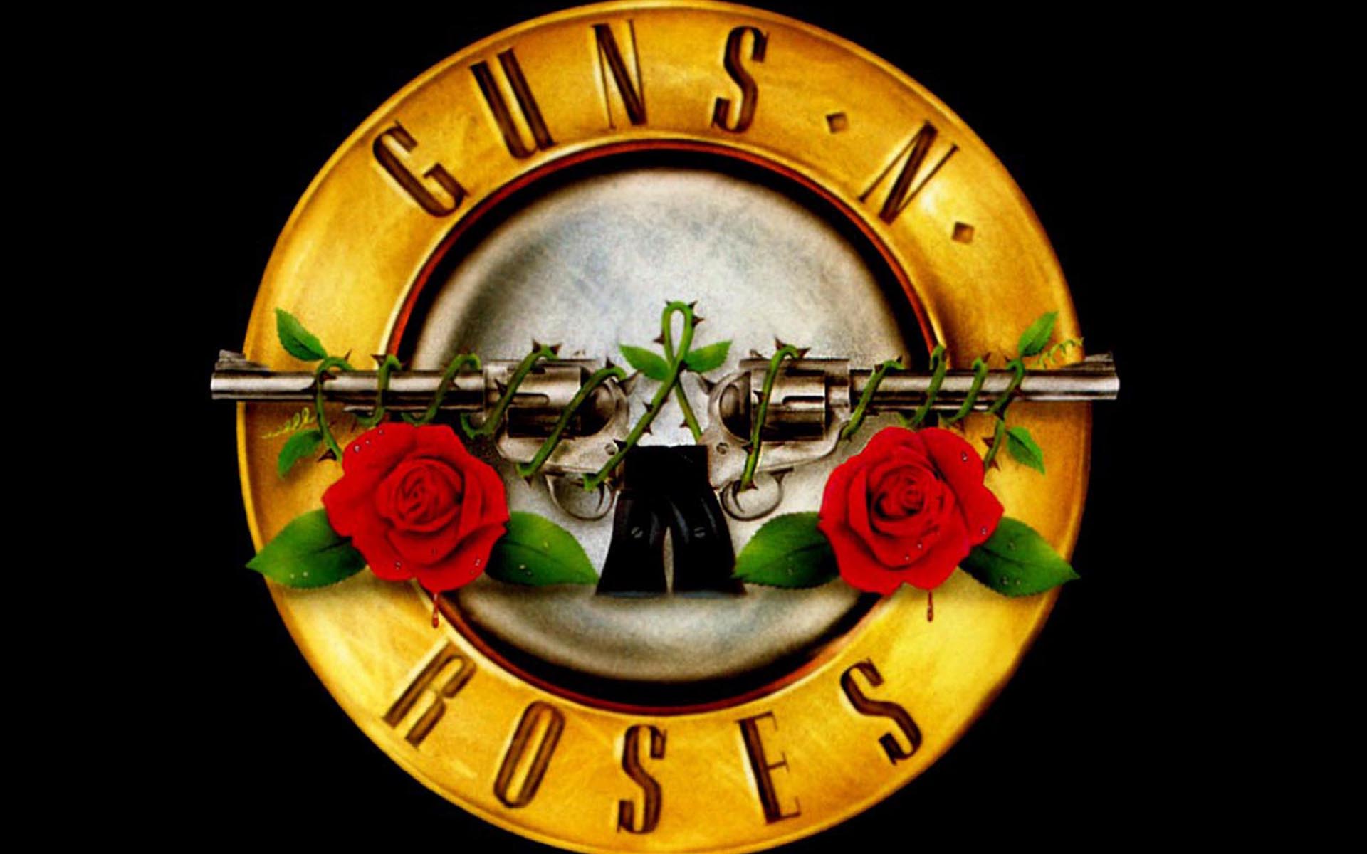
I then looked at a few other band logos such as AC/DC's, Guns N' Roses etc. as I felt that I could get some ideas from their logos too. I especially liked the font on AC/DC's logo, and thought that this was interesting. I also liked the roses on Guns N' Roses logo, and thought that I could combine these two ideas to produce a logo for my band.
 I decided to look on a website called 'Dafont' which would allow me to choose different fonts for my band name. I liked the look of the fonts called 'Clothe' and 'The Blacklist', as I felt that these fit the indie genre.
No comments:
Post a Comment