Monday, 18 December 2017

Saturday, 16 December 2017
Representation
"Representation - the description or portrayal of someone or something in a particular way"
Monday, 4 December 2017
Storyboards
I decided to create a mini-plan on iMovie for the music video to the song itself so I could see how long I needed to film certain parts for. I felt that it would give me a rough idea of what to film and would allow me to test the ideas to the song.

I then decided to create a storyboard which included different camera angles and some edits that I will use in my video. This will allow me to follow a guide as to what will be included within certain sections in the music video.
Saturday, 2 December 2017
Filming day & Recce shots of location
Filming day
I decided to go film my narrative on a Saturday, as this was when everyone taking part were free. The weather was perfect for the filming, as I went in the morning to capture photos and videos whilst it was still light.
The setting for the narrative was a forest and the place that we went to was great for this, as there were lots of greenery. There were also places for my main star to sit, such as logs and small benches which fit with my planned narrative.
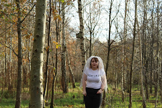 As you can see behind my main star, the setting was suitable and the lighting was bright.


To film the perfomance part of my music video, I used the photography studio which is situated within my sixth form. This was handy, as I was able to get a good, white background for my music video which would portray a sense of professionalism. The filming went well, and I was able to capture both myself and my fellow band member perfectly within the white background.

I decided to go film my narrative on a Saturday, as this was when everyone taking part were free. The weather was perfect for the filming, as I went in the morning to capture photos and videos whilst it was still light.
The setting for the narrative was a forest and the place that we went to was great for this, as there were lots of greenery. There were also places for my main star to sit, such as logs and small benches which fit with my planned narrative.
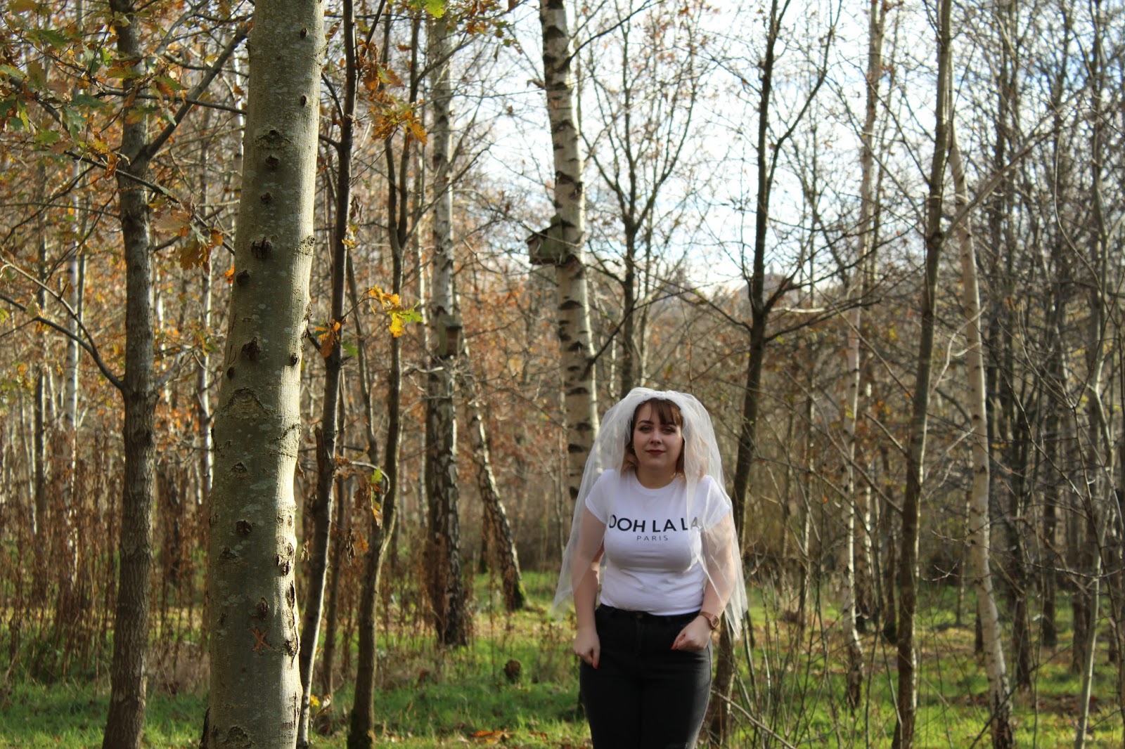
Recce Shots


To film the perfomance part of my music video, I used the photography studio which is situated within my sixth form. This was handy, as I was able to get a good, white background for my music video which would portray a sense of professionalism. The filming went well, and I was able to capture both myself and my fellow band member perfectly within the white background.
Tuesday, 28 November 2017
Logo inspiration
I decided to create a logo for my band which I felt related well to the genre. I looked at several other band logos and the fonts they used to create their logos and thought that these would help with inspiration.
 I firstly looked at indie bands' logos, such as the Arctic Monkeys, Bastille and many more.
I decided to firstly look at the Arctic Monkeys' logo for their album 'AM', as this was something which I thought was simple but effective. I especially liked how the use of a shape was used, combined with font and a frequency wavelength inside of the circle. I felt that shapes were something that was an indie element and that I could do something which involved a certain shape. I thought that in the middle of the logo, the frequency wave had been manipulated into an 'AM' which relates to the title of the album. I thought that this was clever and effective, as this distinguishes the band.
I then looked at Bastilles' logo, which features their band name, but the use of a triangle which replaces the A. I thought that this was interesting and something which was memorable. It distinguishes the band, as when people see the logo, they automatically know who it is. I thought that the use of shapes within a logo was a reoccurring thing and that this was something which I could use my own.
This simplistic logo is for a band called The Neighbourhood. Even though the use of the upside down house is simple, it is incredibly effective as the band is recognised through the use of this logo. I feel that the use of shapes are prominent throughout the indie genre logos, and this was something which I felt that I could include in my own.

Another logo which caught my eye was the band Churches'. I liked the way that they had replaced certain letters with different letters; I think that this makes the logo unique. I also liked the way that they had used three lines to make an E. I thought that I could take inspiration from this to create my own logo.
I then looked at a few other band logos such as AC/DC's, Guns N' Roses etc. as I felt that I could get some ideas from their logos too. I especially liked the font on AC/DC's logo, and thought that this was interesting. I also liked the roses on Guns N' Roses logo, and thought that I could combine these two ideas to produce a logo for my band.

 I decided to look on a website called 'Dafont' which would allow me to choose different fonts for my band name. I liked the look of the fonts called 'Clothe' and 'The Blacklist', as I felt that these fit the indie genre.
 I thought that I would be able to use inspiration from the logos I had researched by maybe having the S and the R in my logo larger than the rest of the font.
I firstly looked at indie bands' logos, such as the Arctic Monkeys, Bastille and many more.I decided to firstly look at the Arctic Monkeys' logo for their album 'AM', as this was something which I thought was simple but effective. I especially liked how the use of a shape was used, combined with font and a frequency wavelength inside of the circle. I felt that shapes were something that was an indie element and that I could do something which involved a certain shape. I thought that in the middle of the logo, the frequency wave had been manipulated into an 'AM' which relates to the title of the album. I thought that this was clever and effective, as this distinguishes the band.
I then looked at Bastilles' logo, which features their band name, but the use of a triangle which replaces the A. I thought that this was interesting and something which was memorable. It distinguishes the band, as when people see the logo, they automatically know who it is. I thought that the use of shapes within a logo was a reoccurring thing and that this was something which I could use my own.
This simplistic logo is for a band called The Neighbourhood. Even though the use of the upside down house is simple, it is incredibly effective as the band is recognised through the use of this logo. I feel that the use of shapes are prominent throughout the indie genre logos, and this was something which I felt that I could include in my own.
Another logo which caught my eye was the band Churches'. I liked the way that they had replaced certain letters with different letters; I think that this makes the logo unique. I also liked the way that they had used three lines to make an E. I thought that I could take inspiration from this to create my own logo.
I then looked at a few other band logos such as AC/DC's, Guns N' Roses etc. as I felt that I could get some ideas from their logos too. I especially liked the font on AC/DC's logo, and thought that this was interesting. I also liked the roses on Guns N' Roses logo, and thought that I could combine these two ideas to produce a logo for my band.
 I decided to look on a website called 'Dafont' which would allow me to choose different fonts for my band name. I liked the look of the fonts called 'Clothe' and 'The Blacklist', as I felt that these fit the indie genre.
Friday, 24 November 2017
Equipment list
For the music video, the items I will use are:


- Cameras - I used a Canon camera to capture my as this would allow me to record high-quality content.
- Tripods - this would help me to stabilise my footage.
- Coloured filters - the coloured filters were an initial idea for the music video, however with using the software Premier Pro, I will be able to alter the colours and styles within that.
- Guitar - I used an acoustic guitar, as this had an Indie style and reflected the genre. I took the guitar design into consideration, as I needed it to have an indie style to show that I have researched the genre.
- Lighting - lighting is an important element within my music video, as I feel that I need to get the right amount of light to represent the indie genre.
- A high key lighting studio - I will use a high-key lighting studio to capture my videos, as this will allow the music video to have a professional feel.
- Wedding dress & veil - as my plan for the video is a female who has run away from a wedding, I needed to represent this throughout the video.
- CD player/Phone - this will be used to play the song and will allow me to lip sync in time with the lyrics.

I will use a variety of shots within the video including:
- Establishing shots
- Close-ups
- Tracking Shots
Tuesday, 31 October 2017
Digipaks
A digipak is a type of packaging for CD's and DVDs, typically made out of cardboard with a plastic holder for the disks inside. They were among the first alternatives to the jewel (plastic) cases and grew in popularity among record labels and artists in the 2000's.

An example of a digipak is All Time Low's 'Future Hearts'. This features 6 panels, with a mixture of photos of the band, the logo and other images.


An example of a digipak is All Time Low's 'Future Hearts'. This features 6 panels, with a mixture of photos of the band, the logo and other images.
The front cover features the band name, their logo and the name of their album. The logo features birds; this is something which is on most of their albums. The colour scheme of blue shows that their sound is maturing; their previous colour schemes were dark colours which represented the punk genre.
The font of 'All Time Low' is bold, and stands out from the rest of the album.
I felt that this was something I could take inspiration from, by using a mixture of photos of the band but also other things, such as the logo, which are eye-catching.
Another example of a digipak is Rihanna's 'Loud' album. The colours used are vibrant and stand out; this is stereotypical of the pop genre. Rihanna's face is prominent on the album cover; this is so the audience knows who the artist is. The photo featured within the inside the digipak looks like she's wearing a wedding dress. This could connote what the lyrics may be about on the album and how the artist is wanting to show herself like.The text on the album itself is simple and isn't prominent on the album cover; this could represent that the artist wanted her face to be the main attraction within the album. The album has one main colour which is used on both the front and back; this was the colour of Rihanna's hair during the making of this album. The colour is featured on all 6 of the panels and creates a theme. The conventions of the pop genre suggest that the artist creates popular music. This could be represented through their choice of album cover and colours within the digipak.
Subscribe to:
Posts (Atom)